
Hello, world. Recently I’ve bought a book that actually contains 101 principles but I’ve merged a few of those into one or removed some finding them not so important for 2019 and I’ve read it and I couldn’t just go on with the next book till I comment this one with you guys. It’s written by Will Grant and published by Packt. I am not saying that this book is good or bad I am just gonna write down each one of those 101 principles and tell my opinion about it. Let me know what do you think.
#1 Everyone Can Be a UX Professional
I actually do agree with this one. Once you reset your mind to very minimalistic design and take all devices into consideration, you will be able to have a different perspective and be good at UX and be able to make efficient and clean UX design.
#2 Don’t Use More Than Two Fonts
I agree with this one as well. I usually use two fonts for websites or digital products that have lots of content. I make sure I match the fonts from the same family so they can look good together. I use one for titles and one for content. Over the years of my professional experience, this has been proved to work well.
#3 Use the Fonts That Users Already Have Installed in Their Devices
Exactly. I call them web-safe fonts. Usually, those are the ones you can find on Google Fonts. But, from a technical perspective, even though your designer did an amazing job with branding your product and created an amazing font to make everything look better and distinctive, your browser is going to need some additional time in order to load the font file. This is not a small detail, for one average mobile user with average internet speed, this additional font loading can extend app or website loading time up to 3 seconds. It all depends of course on the technology you’ve used or how did you pack all your resources. This phenomenon is known as FOUC. So make sure you always prefer to use preinstalled system fonts.
#4 Use a Font Size to Highlight the Importance of the Information
Now, this is where I don’t agree completely. You see, in the case of a normal article, yes, the font size is important. You can easily differentiate titles from the main text by setting up different font sizes. This is not a case for some other more corporative and complex UX designs where you just need to put so many options and information within one page. This is a case where I prefer color. It’s just more natural and modern. For example, if you gonna show an error to a user for a wrong password, you shouldn’t go with a bigger font size, you should go with a different color like RED or maybe even a sound effect in some cases. So make sure you choose wisely when it comes to this one.
#5 Choose Wisely a Default Font Sizes
This is definitely a valid statement. You just gotta go and follow standards. If you are not sure what the standards are, I suggest you go and google for default Bootstrap font sizes. This will make it easier for you. You need to make sure that your font is not way too big to suffocate your user and not too small, you don’t want your users to go and zoom in their screen just to be able to read your content. When it comes to content, today’s standards are 16px with 1.5 line-height, although, I recommend using REM instead of PX. You can google and find out why.
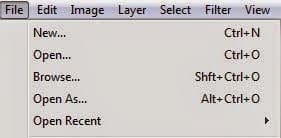
#6 Use Three Dots to Announce Next Step
This is normal and expected as by default. Every time i see three dots, i just get a natural feeling of something coming into my way. Here is a perfect example by Photoshop interface:
#7 Design Buttons to Look Like Buttons
Ok, mister Will Grant (author of this book). You and I are about to discuss this one. The minimalistic design of buttons is NOT bad as Will claims it is. Users are NOT that stupid and uneducated when it comes to technology. This is not the nineties anymore. People are used to digitalization and technology. Buttons should be minimalistic and fit into the design well. They don’t have to look like buttons. They should be seen as a button from each of the three perspectives (x, y, z). I prefer making buttons a more interactive and touch-friendly device. A button can also be circular, a whole section of the website can be a button and serve a purpose on a touch device. Windows Metro design is good and interactive, not bad as Will says. You can’t compare a real-life button with a digital button anymore, you just can’t. Especially not in 2019 when all our devices don’t even have that many buttons anymore, most of them are touch devices. Will used the elevator and car buttons as an example but even those are getting rid of buttons. Tesla, one of the most famous car companies in the world is a pure example of this. By following user’s behaviors on the website through Google Analytics, my theory also turned out to be better performing than the one that Will is suggesting so I stand firmly behind my opinion here since I have proof for this.
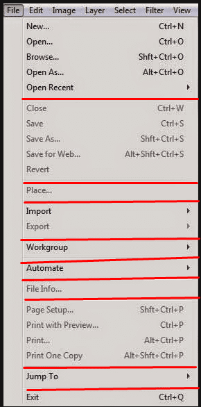
#8 Buttons Need to be Sized Logically and Grouped by Their Functions
Now, this is something different and yes, I do agree with this one. The Photoshop interface from above is just another great example of this.
#9 A Whole Button Should be Clickable, Not Just Button Text
Again, this is just common logic. Of course, a whole button needs to be clickable. To be honest, there were some websites where I’ve found only button texts to be clickable and I was wondering how was possible to be missed, by the developer. It just ruins a whole impression of your digital product if you have glitches like this. Yes, that’s right, this is a glitch, not a design preference.
#10 Don’t Try to Invent New Unusual Interface Controls
I mostly agree with this, but not completely. To skip a long explanation, as for example I will add new and modern sliders on a website. A few years ago, we used to have simple number fields for let’s say an online mortgage calculator. Today we can place a slider that looks nice and does a real-time calculation as we move a slider to the left or to the right. Another good example is Microsoft’s Surface Dial and Apple’s Touchbar on their MacBooks as well as companies adding vibration feedback when you press harder on the screen in order to simulate a “hard button” press. This is all relatively new since it was introduced a few years ago and it has been proven to work perfectly and actually being loved by consumers.
#11 Search Fields Should Have a Search Button With a “Search” Text
I agree. This is the expected behavior. The text doesn’t necessarily have to be “Search”, but still you gotta let a user know it’s a search filter. On some rare occasions, like a filter field that has an auto-suggestion and filters content as you type instantly, a search button can be excluded but I still prefer to have it visible. In the same way, we use alt-tags for images, buttons can help people who use accessibility options for browsing.
#12 Sliders Should Only be Used for Choosing Approximate Numerical Values
Yeap completely agreed. I’ve wanted to break things so many times while using slider where I’ve wanted to pick an exact number and my mouse or hand just weren’t accurate enough. A simple goddamn number field would be much better, don’t you think!?
#13 Use Numerical Fields for Whole Numbers
Yeap, you gotta limit users. If you expect the ONLY number from a user then give him a number field, not a text field. Simple as that.
#14 Don’t Use a Dropdown Menu if it Only Has a Few Items
Exactly, it has no point. Although I do find myself guilty using this hack sometimes when a client wants way too many items in a navigation bar. Please don’t tell anyone.
#15 Let Users be Able to Undo Their Actions
Ah… This is so true on so many levels. We are humans, we make mistakes all the time. It’s completely normal. Being able to undo your action is a very satisfying feeling. Wish I could that in a real life. Maybe in a few decades ha? It’s a standard to have a default CTRL + Z keyboard shortcut or to make a little popup that appears after crucial actions such as deleting a file that says for example “File deleted” on one side and gives you an “UNDO” button on the other side.
#16 Think About Elements Outside of Screen View
I am glad that Will mentioned this. It can be really, and I mean REALLY helpful and can make much difference if you do it right. A very good, perfect example is YouTube. So you are watching a video and you click a full-screen option. Suddenly, you see only a video right? But when you move a mouse cursor or touch a screen if you are on mobile devices, many options and information appear on the edges of the video, still not covering a whole video while allowing you to use the user interface. Really, this is a perfect example.
#17 Use Infinite Scroll for Pages With a Lot of Content
Yes! Please do! Pagination is not mainstream anymore. Imagine if YouTube had 5 videos per page and you would have to click Next and wait for the next page to load in order to see the next 5 videos. How painful would that be ha? Instead, just go and use an infinite scroll, or as we programmers call it, lazy loading. It will save us all time and nerves.
#18 Use Pagination When Content Has the Beginning and The End
Definitely. Nothing that much to say about this. Forums are a good example of this. With this type of content, it’s also good to add filtering, sorting, and searching capabilities.
#19 If You Use Infinite Scroll, Save the Last Position
This is to be done by default. If I switch tabs to check my Facebook, email, or anything else, I want to continue where I’ve left off and not be returned at the beginning of scrolling.
#20 The Starting State of the App Doesn’t Have to be a White Background
This is the case with apps showing some content and logically it takes time to load that content. So in the meanwhile, while content is being loaded you can usually see the only white background. This can be a very confusing practice. So don’t do that, either put a splash screen until content is loaded or some loading animation, progress bar, etc but never leave a white background.
#21 Allow User to Skip Help Information and Tips and Hints Overlays
I get it, you want to help your users find a way around the interface, an app, or even a website. This is very noble and very helpful. But in most cases, developers don’t remember the state of the app or website. While remembering the state can be complex, adding a simple “Skip” button or link is very simple to do. Definitely, something you should do so that your users don’t have to go through the explanation process every time they install an app or visit a website on their new devices.
#22 When User Loads New Content, Make Sure to Show Content That Wasn’t Seen Before by That Same User
Pretty much self-explanatory. This is the case for almost every social media. Make sure you know what users already saw before and show your users only new content.
#23 Don’t Hide Content Inside a Hamburger Menu
Now, I am fine with Hamburger Menu on websites but inside the apps… It’s just a big NO. Why? Because it’s usually much easier to have a navigation bar at the bottom, NOT top because nowadays, all the phones have huge tall screens and not everyone can reach for the top corners in order to open a menu. You can also use sliding gestures to work together with tabs and it will still look better than Hamburger Menu.
#24 Links Should Look Like Links
I am fifty-fifty on this one… I believe that you can strip link decoration and underline and still make it look like a link. For example, if your website accent color is blue and you have a white or grey background with black content, of course, you can color link text into that same accent blue color without underlining it and it will still look good, even better, and be obvious to users. When it comes to links behavior, you should definitely mark visited and non-visited links with different colors. It’s just convenient that way.
#25 Split the Menu Items Into Sections
This one of those small details that can change a lot when it comes to UX design. Here I’ve color an example for you. Pay attention to how menu items are nicely split into several sections:
#26 Hide Advanced Settings From Most of the Users
Completely agreed with Will on this one. Now, this is not an often case on websites and apps but is a very often case for desktop programs. You want your users to only go advanced if they know what are they doing. This is often seen during the installation of almost every program on Windows and macOS systems. Like, during installation you are offered a default location where to install a program but of course, you also get an advanced option to choose installation location all by yourself. This is one of the most simple examples of course but usually goes much deeper. I am very glad that Will mentioned this one, I would’ve never remembered this one.
#27 Highlight Important Menu Items and Links at the bottom of the Screen
A very pure example of this is a website with a navigation bar and a footer section at the bottom. They both share some mutual links and are being repeated. This is done for many reasons. They say that you have exactly 7 seconds to leave the first impression on your user. That’s 5 if you deduct loading time. So once the user lands on your website he will see a navigation menu and either click somewhere or continue to read through the content and then choose or look for what he needed after he is done reading, which is usually at the bottom of the page isn’t it? Another strong reason is SEO (Search Engine Optimization). You can read online more about internal and external linking and how is that beneficial for SEO indexing. It’s also a good practice to feature a search bar at the bottom of your website or app if it contains lots of information.
#28 Always Use Same Icons Inside Your Digital Product
UX design consistency is one of, if not the most important rules to follow. When designing a UX, you are speaking a language. You don’t wanna speak a different language on each page inside your website, do you? Oh, and it’s also easier for developers to go with the same resources, not to mention that your website or app will be lighter as well.
#29 Don’t Use Old Icons
So if you are not an exception with your product focused on the nineties or some retro fan page, you shouldn’t be using any old icons. I agree with this statement. What is considered by old icons? For example, placing a cable phone under contact number or using a floppy disk icon or even a CD icon for music and so on and on… Adapt to the future and use new ones.
#30 Don’t Try to Represent New Command With an Existing Icon
This doesn’t happen often but it happened to me a few times so I definitely understand what Will is saying. Recently I saw this being a case with a Blockchain. People were trying to showcase it with some existing icons but that just wasn’t the case. We had the same issue on Herc and AnthemGold till our brilliant designer Grey got sick and just invented new icons for this new futuristic technology.
#31 Never Use Text on Icons
Is there even a need to explain this? Good, let’s move on.
#32 Always Use Labels With Icons as an Explanation
You are not just going to place an icon somewhere inside your digital product and expect your users to predict what is it for. Don’t be a lazy developer or designer and add a little label somewhere around the icon to explain what is it for. Only one word could help a lot.
#33 Emoticons are the Most Famous Icons in the World
Think about it, they really are. They are literally a new universal language everyone understands. Use them as an advantage inside your digital products.
#34 Whenever Possible, Use System Predefined Controls for Data Input
There is no need to go and code a whole new keyboard inside your app when you could just call for a native default keyboard. This is not only about the keyboard of course. App developers are more familiar with native resources and how to invoke them.
#35 Hide a Password Field Text but Offer “Show a Password” Option
It doesn’t have to be a text, can be an eye icon or little placeholder. Do not worry, you are not breaking any privacy rules if you allow the user to reveal the password himself. After all, the password field can always be inspected on the webpage and be changed into a text type of field and it will show your password anyways. This is a handy hack for people who save their passwords inside the browsers and then forget them.
#36 Always Enable User to Paste his Password
No! Big no! Come on Will, what you were thinking about? This is not an “ALWAYS” case. Yes, it’s handy in many if not the most use cases but when it comes to the fintech industry this should be highly avoided. There are transaction information and crypto private keys and security phrases that can be hijacked and stolen directly from your clipboard if you are not careful and users could lose millions because of your code. Please, be careful about this, I can’t tell you more since it would be illegal to write about it, but this is a fatal mistake and it should be avoided.
#37 You Don’t Have to Check if Email Address is Valid
I agree. This was expected and actually a good practice to do before few years but today and in the future, there are and will be new domain extensions all the time. Writing and updating your email validation code would be a pain for this. Just skip it and leave an email input field and let the browser do the rest. It would be good to mention somewhere around or inside the field that you are asking for an email address explicitly. You can check the email address by sending a verification email with a link to confirm but this is done from the backend.
#38 If not Asked by User, Don’t Delete Written Data
This is a conflict between reality and UX I know. But imagine a scenario where some old person is using their small phone with a small screen to fill in some online form and accidentally touch some link or button and refresh the page and lose all the information inside the form which took him 20 minutes to fill-in? Don’t you feel bad right now even that this is about a hypothetical old person? It’s ok I feel bad as well. Make sure data stays there and simply offer your user a “Cancel” or “Clear” or “Delete” options. Whatever just make it convenient for him, I trust you will do the right thing.
#39 Choose a Proper Field Type for Multiline Text Field
Agreed. Just go along with a resizable text area. Can’t go wrong there.
#40 Don’t Make a User Interface That’s Moving While Being Used
Only evil trolls would do this. You don’t want your users to go on and break stuff around their house.
#41 Properly Design and Code Date Pickers
Will is here referring to the older type of date pickers, this issue has disappeared lately thanks to smartphone manufacturers and many front-end frameworks.
#42 Automatically Fill in Username When User is Trying to Reset a Password
Yes, this will save a few additional clicks for the user and make a whole workflow smoother. If I type in my email and password and get a wrong password error, the first thing I am going to do is reset a password, it’s logical that I will be using an email that I tried to log in with.
#43 Fields for Data Entry Shouldn’t be Making a Difference Between Big and Small Letters
What!? This is one hundred percent wrong statements. Every programmer who worked on several systems will know this. Won’t even bother explaining this. You surprised me with this one Will. Shame on you.
#44 If Form is Nicely Designed and Light, Your Users Will Love Your Product
Of course, this is a case for everything. It’s kind of a general rule. Not so much to discuss here.
#45 Check for Validation of Written Data ASAP
This should be a standard in my opinion. Imagine a scenario where you are filling a huge sing up form and it doesn’t tell you that your username is taken until you click submit and then you have to start all over again. ARGHH! Makes me mad just thinking about it. Developers, please do instant data validation, it’s not that hard I swear.
#46 If One of the Fields Inside the Form is Wrong, Show User Which Field Should be Paid Attention to
Agreed. It will speed up a whole process and help your users find where did they make a mistake so they can correct it as soon as possible.
#47 Forgive – Your Users Don’t Know and Don’t Care Which Type of Data You Need
This is true. Never try to predict a user’s behavior. It’s rude to do that. Some users would like their username in emoticons or maybe some other type of writing, maybe Arabic or some Serbian or Dutch special characters? It’s their own right. As long as it follows universal Unicode, allow them to input their desired data and don’t try to limit them that much. This is a case for global products, if your product is local and country-specific then it would be a little bit different.
#48 Choose a Matching Element for a Dedicated Task
This reminded me of one website I saw a few weeks ago. I was reading and registering for some online services and I’ve got Terms and Services agreement contract to agree and of course, you would expect a checkbox to check where you agree or not right? Well, I had a dropdown with a blank option, “Yes” and “No” options. It’s funny but we shouldn’t be laughing about this, to be honest. Nobody is perfect, right? Yeah right! I took a screenshot and sent it to all the coder friends I know so we can laugh together!
#49 Allow Users to Input Their Phone Numbers as They Desire
Agreed. Even a giant company such Whatsapp once had an issue with this but it was fixed overnight.
#50 Only Ask for Essential Credit Card Info
Ask just for the info you need in order to proceed with the payment. There is really no need to ask for more than that. It will make your users suspicious and frustrated.
#51 Allow Your Users to Easily Enter Their ZIP Codes
Postal codes are different all around the world. There is no need to go and try and limit or guess their ZIP Codes as attractive as that might sound to you. Just give them a normal autocomplete input field and get over it.
#52 Don’t Add Decimals Inside the Currency Value Fields
Adding decimals automatically often causes mistakes when it comes to normal users. They might pay 1000 instead of 10 if you do it. Allow them to enter decimals themselves, then if they don’t do it, just add .00. And ALWAYS ask for the user to confirm the transaction, not only for mutual convenience but for legal reasons as well.
#53 Importing Pictures Should be Simple
Ugh… This could be expanded into a whole new post really. I definitely agree with this statement thou. A simple browse button with a drag & drop possibility and the preview should be enough. If on another hand you are focused on picture mainly, you should add rotating and cropping possibilities. And also, make sure you support all the main picture formats and resolutions.
#54 When Expecting an Action to Last Longer, Use Progress Indicators
Big yes! I don’t want to sit around and don’t know how much I need to wait for the progress to be completed. Give me a god damn progress bar or at least a percentage. Let me know how much of my precious time is going to be wasted on this action!
#55 Use a Spinner When Action is Taking a Long Time
Sometimes action can’t be calculated because of many parameters and that’s fine. Using a spinner AND showing an info text to the user letting him know that it might take some time for a task or action to be completed is a proper practice when it comes to UX.
#56 Big Contrast on the Screen is Your Friend
Will is mostly thinking about the text here and yes he is absolutely right. Some websites and apps tend to use light grey letters for less important information to show inside their digital products. This is not a good practice, especially not for Accessibility users. Also, not every screen in the world has a perfect white balance and contrast setting, therefore that small grey information text might be invisible to some users.
#57 If You are Forced to Use Minimalistic Approach, You can Add Visual Effects to User Interface
Minimalism is generally recommended to everyone. Makes everything lighter and smoother. Decluttering can be often a good practice. But if you want to stand out in some way you could always add visual effects to UI. For example, you could highlight field borders when the user is typing inside the field of zoom in an image or icon when the user is hovering over it and so on, you have many options when it comes to this approach.
#58 Avoid Multi Meaningful Symbols
Oh yes Will, I support you on this one. I know a good example of this. I once saw a picture uploading library that had a huge plus sign over images. My first impression was me wondering if this means adding a picture here or zooming the ones I see behind the sign. So yeah, make sure you don’t confuse your users in this way.
#59 Your Links Should be Clear Enough Without Additional Explanation
This kind of mistake happens often to be honest. I probably make them unconsciously as well. Avoid using links with a label “Read here”. Users who use screen reading software will read that as “…read here read here…”. Use attribute links that are self-explanatory without additional explanation. This will drastically improve your website indexing and make your website easier to be read by reading software.
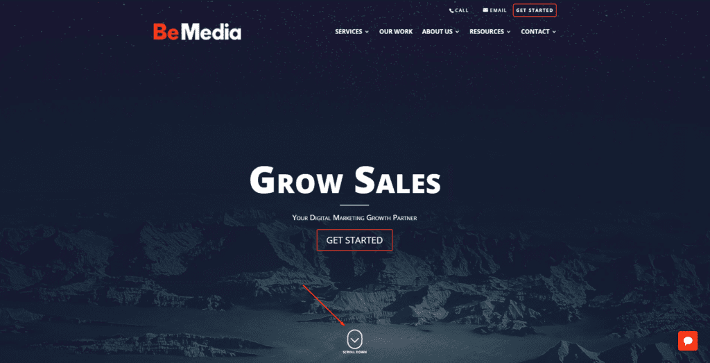
#60 Add “Skip to Main Content” Links
This a good practice but make sure you use the latest standards. Don’t literally write down like that. Add an icon or something. Here is an example of one of the latest websites I’ve coded. You can see an arrow that when you click on it shows you the main content.
#61 Don’t Rely on Colors to Pass Information for You
This is true. You can’t color an error in red color without writing error information and expect the user to guess it’s an error. Make sure you always add additional information.
#62 Avoid Preventing a Device Zoom Using Meta Tag
I would never think of this. Well done Will. So yes, make sure to NOT include this meta tag:
<meta name=”viewport” content=”width=device-width, initial-scale=1.0, maximum-scale=1.0, maximum-scale=1.0, user-scalable=no”>
#63 Allow Users to Cancel Notifications That They Don’t Want to Receive
It doesn’t matter if it’s an app or a website, make sure you give your users an option to opt-out of your notifications or emails or whatever they are getting.
#64 Buttons on Touch Devices Shouldn’t be Smaller Than Fingers
I didn’t expect to read this in this book to be honest but i do agree with this. It just makes sense. Let’s move on.
#65 Help User go Through the Workflow
This is a serious issue that many companies have. Once they get leads they are not redirecting them well and they lose them on the way. This is how bounce rates get worse and shopping cart drop-offs happen. You need to make sure that the user’s “‘journey” through your website or an app is controlled and carefully tamed. Not to be rude, but it’s like when you are controlling a big herd of sheep back inside their houses. Sheep are your users. Once again, I didn’t mean to be rude but it’s a perfect metaphor for this situation.
#66 User Should Always Know How Far he is Inside a Whole Process
True, if the user is filling a survey or something similar. Let him know how much he completed and how much there is left in order to finish the process. Trust me, it helps a lot.
#67 Use a Humanized Version of Navigation
Yeap, yeap. Very good use of this kind of navigation is often found in online shops. For example, if you go and navigate and find a product you like, you will often see somewhere on the page a full path to the product you are seeing, something like this. “Home->Shop>Smartphones>Samsung”. Makes everything easier.
#68 If User Have Started a Process That Doesn’t Need to be Finished, Give him a Skip Option
This is to be found inside the big sign up forms. You can find so many input fields there such as gender, Street Address Two, Age and so many more that are not required. Ask your users just for important and needed information, don’t be a pain in the a**.
#69 Users Don’t Care Who You are, They Just Want to Finish Their Business
This is not completely true. If you are an online shop or a designer or developer, of course, the user is going to be there to see who you are and your portfolio. Gotta make sure you feed your users with the information they want to see. Justify their time on your website.
#70 Show a Warning if User Didn’t Save his Work or Settings
It happens all the time. You changed account settings and just continue to the homepage realizing too late that you had to save your settings before moving on to the homepage, so be a bro and warn your users to save their “stuff”.
#71 Don’t Bore Your Users Asking Them to Rate Your App
We all use smartphones, I am not going to explain this since we all have experienced this.
#72 Make Sure to Design Authentic and Original Favicon
This doesn’t only show your branding, it’s also being shown on the browser tabs and saved shortcuts. It identifies you in a graphical way. Make sure you give your best to design it.
#73 Allow Users Easier Way of Paying for Your Services
Oh, I agree with this one. I like how Google Play lets you input your payment info once and every next time you buy something all you have to do is place your finger on the fingerprint sensor. Paypal and Payoneer are also doing this which is awesome.
#74 Show, Don’t Talk
It’s widely known that people react better to images and videos than text. It’s why social media has such a big influence all around the world. So make sure it’s not all the pure text on your website or app. Give them some pretty stuff! After all, “One picture is worth a thousand words”.
#75 Talk to Your User Like You are Talking to a Human
This sounds silly but I understand what Will is saying here. Developers often have this issue with using way too many non-natural words that only they are familiar with. When coding, make sure you write your code from a user’s perspective, not yours. Do not let your product sound way too official or corporative. Don’t forget that by choosing which words you are using you decide how the user’s perspective about your product is going to look like.
#76 Use Active Verbs, not Passive
That’s right, I am probably not applying this method myself that well since I am not a native English speaker and my English is not that good but I try to learn more. There is a whole psychology behind using active and passive verbs. You can google it if you are curious about it.
#77 Don’t Betray User’s Expectations
You need to know what’s expected from you and your product from your future users before you push your product into production mode. Failing to fulfill user’s expectations can negatively affect your business so make sure you do proper research from the user’s perspective before going live.
#78 Reduce a Number of Actions to be Done by User by Including Default Settings
Gotta make everything smooth. With minimalism, it’s expected to save not on design and content only, but on time as well. So help your users save some time and offer default settings.
#79 Question “Does it Work on Mobile” is Old School
Don’t even think about it! It has to work on mobile. More users browse the Internet on mobile devices than they do on their computers. Everyone knows this. It’s a gold standard for your website to be responsive. Don’t even think about not making it mobile friendly because your ranking will be hardly punished by Google.
#80 Don’t Bait Your Userbase
This wasn’t in the book but I’ve wanted to add it. If you have thousands of users that you’ve gathered inside your database don’t spam their inboxes or send them notifications trying to make them click on email or notification. Offer them real value. Everyone hates click-baiting.
#81 Test Before Going Live
This is a very important principle. This is intentionally being the last one in this article in order to highlight its importance. When I say test, I mean test it with real users, not automated scripts. You need humankind of tests. There is no such AI or script that can simulate a human’s complex nature and behavior trust me.
So that’s all peeps. Sorry for the long post. Let me know what do you think about these principles and feel free to hit me up if you think that I’ve forgotten something important to add.
0 Comments